BRAND IDENTITY
UX Result
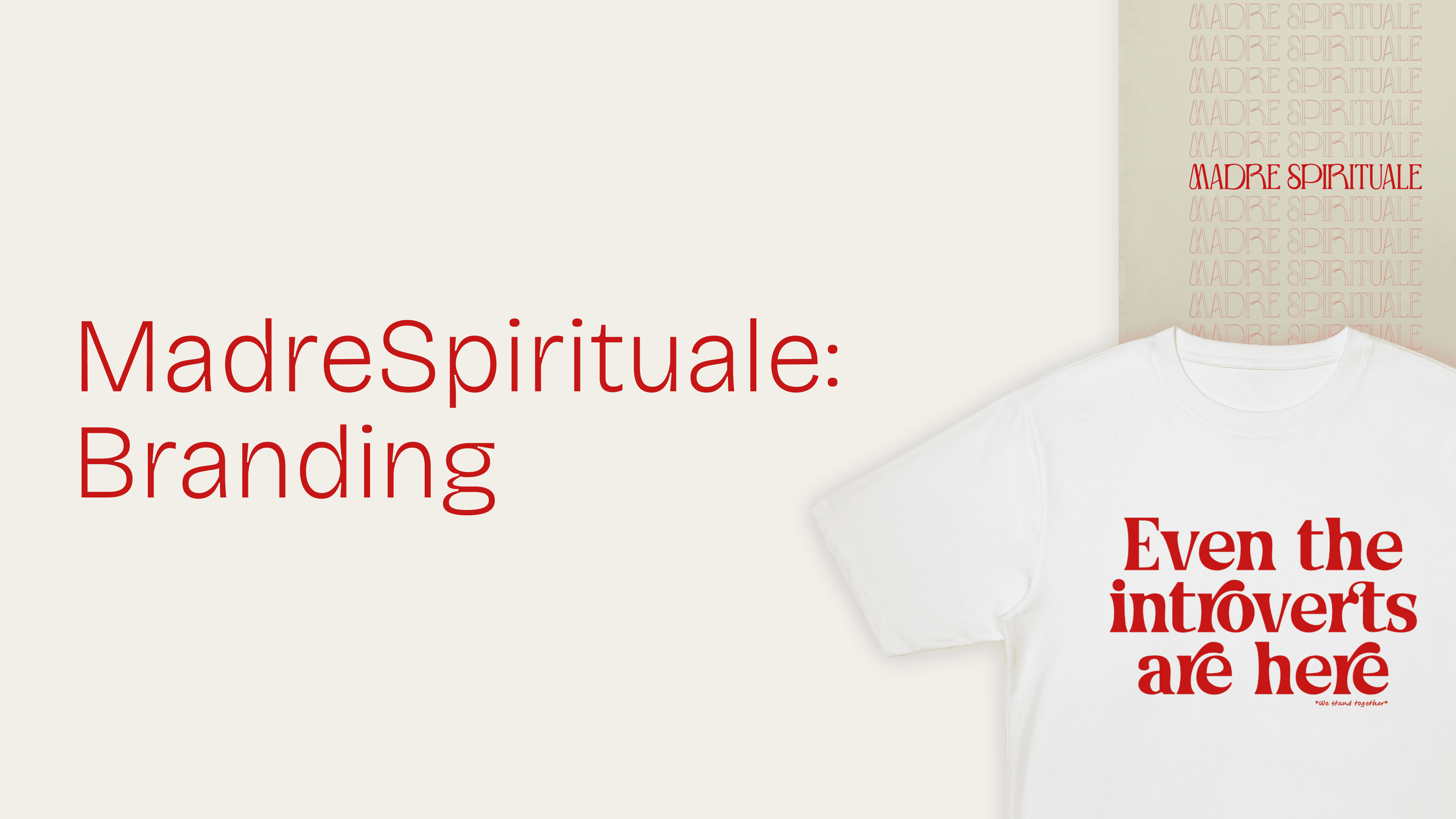
The branding for MadreSpirituale successfully established a distinctive visual identity that blends artistic heritage with modern irony. By combining classical art with witty, contemporary messaging, the brand aims at appealing to a style-conscious audience that appreciates both humour and aesthetic refinement.

Project Context
MadreSpirituale is a brand that transforms iconic paintings into wearable statements, combining classical art with ironic and thought-provoking quotes. The challenge was to craft a cohesive graphic identity that captures the essence of the brand—modern, playful, minimal yet bold.
Identifying Challenges
Creating a strong brand identity: Developing a visual system that would be instantly recognisable across products and platforms.
Maintaining minimalism: Keeping the designs clean while allowing the humour and artistic elements to stand out.
Versatility across products: Ensuring the branding worked seamlessly on different merchandise, from t-shirts to mugs and accessories.
Setting Objectives
Developing a graphic language that blends classic and contemporary aesthetics.
Creating a product line with a consistent yet flexible visual system.
Establishing a minimal yet impactful identity that highlights the irony in each design.
Ensuring brand recognition through cohesive typography, colour choices, and layout strategies.


Research & Insights
Art and pop culture crossovers: Studying how contemporary brands have successfully reinterpreted classical art.
Typography and humour in branding: Exploring how text placement and font choice can enhance irony and readability.
Minimalist design in fashion: Understanding how simplicity can elevate rather than diminish a statement piece.
Design Process
A bold yet minimal logo: A clean typographic mark that aligns with the brand’s sophisticated yet playful nature.
A distinctive product design approach: Merging royalty-free classical artworks with sharp, ironic typography in a balanced composition.
A cohesive visual system: Ensuring consistency in typefaces, layout, and colour application across all products.
Implemented Solutions
Typography as a Design Element: A carefully selected typeface that enhances both the humour and the premium aesthetic of the brand.
Neutral yet impactful colour palette: Allowing the artwork and text to stand out while maintaining a modern and sophisticated look.
Conclusion
MadreSpirituale’s branding is a testament to the power of graphic design in shaping a brand’s identity. The result is a product line that not only resonates with a design-savvy audience but also transforms everyday fashion into a statement of wit and creativity.